Weeks 13 and 14 tips and FAQs
Hi everyone!
Just a couple tips/FAQs for these last couple weeks:
Sometimes the colors in the viridis palettes are too dark, neon, pale, or light—can I adjust those?
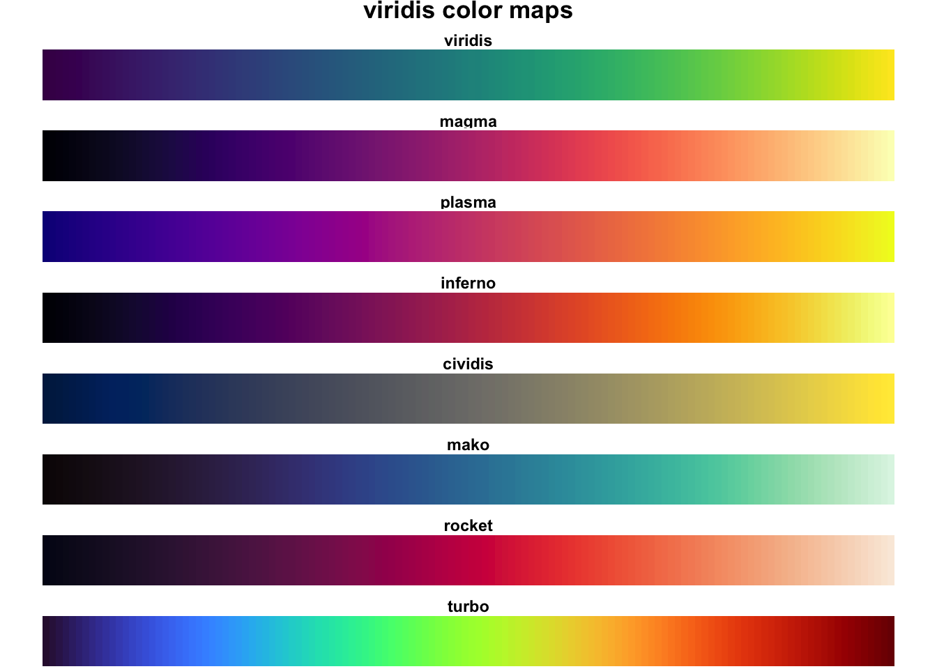
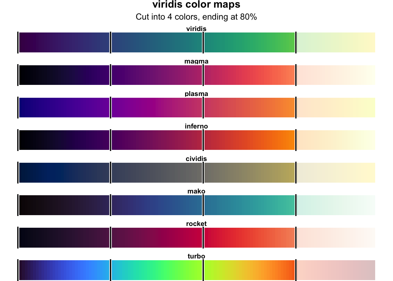
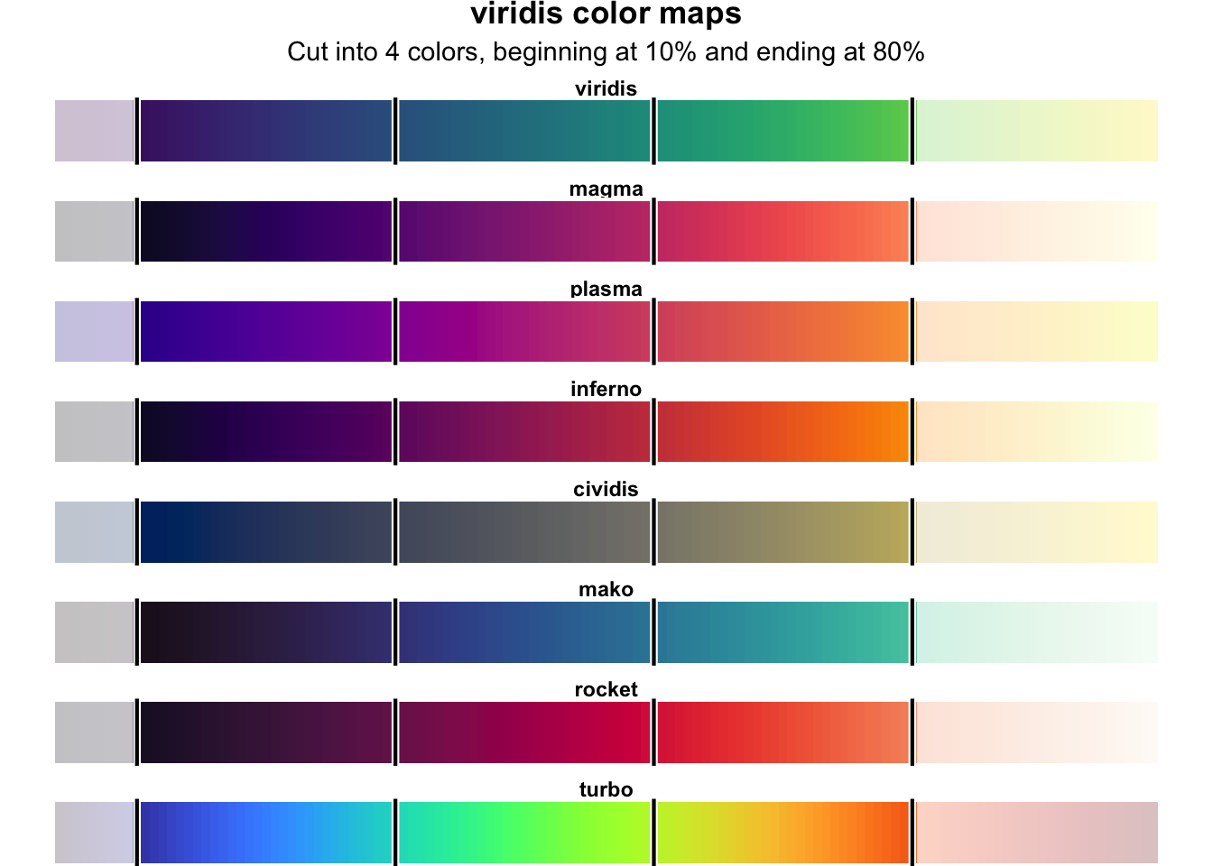
You’ve seen and used viridis throughout the semester, and you may have even experimented with some of the different viridis palettes or color maps like magma and plasma. There are 8 different viridis color maps:
When you use scale_fill_viridis_d() or scale_color_viridis_d(), ggplot chops the viridis color map into evenly spaced colors along the range of the gradient. For instance, if you have a plot with 4 categories, you’ll end up with these colors:
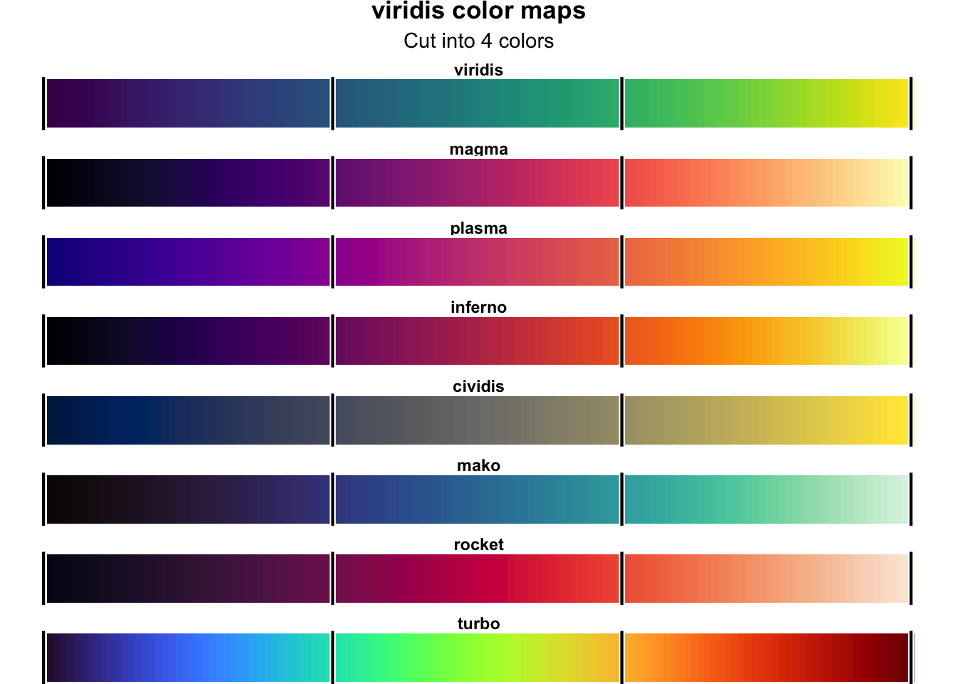
For some of these palettes, that works just fine, like with viridis and turbo. All of these colors are nice and legible:
library(tidyverse)
library(gapminder)

plot_data <- gapminder |>
  filter(year == 2002, continent != "Oceania") |>
  group_by(continent) |>
summarize(n = n())ggplot(plot_data, aes(x = continent, y = n, fill = continent)) +
geom_col() +
scale_fill_viridis_d(option = "viridis") +
labs(title = "viridis") +
theme_bw()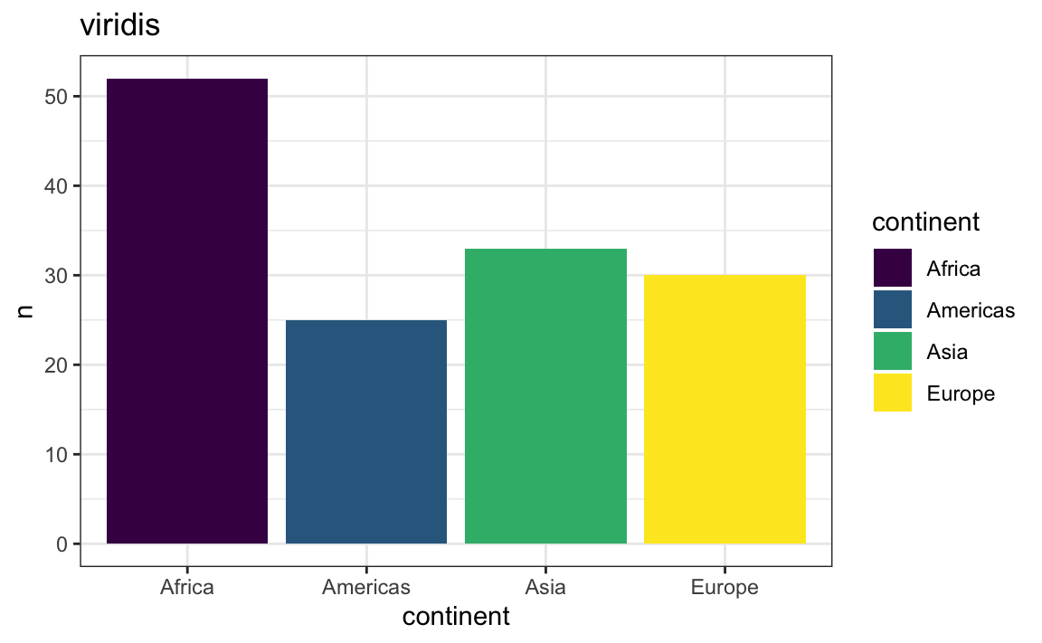
ggplot(plot_data, aes(x = continent, y = n, fill = continent)) +
  geom_col() +
  scale_fill_viridis_d(option = "turbo") +
  labs(title = "turbo") +
  theme_bw()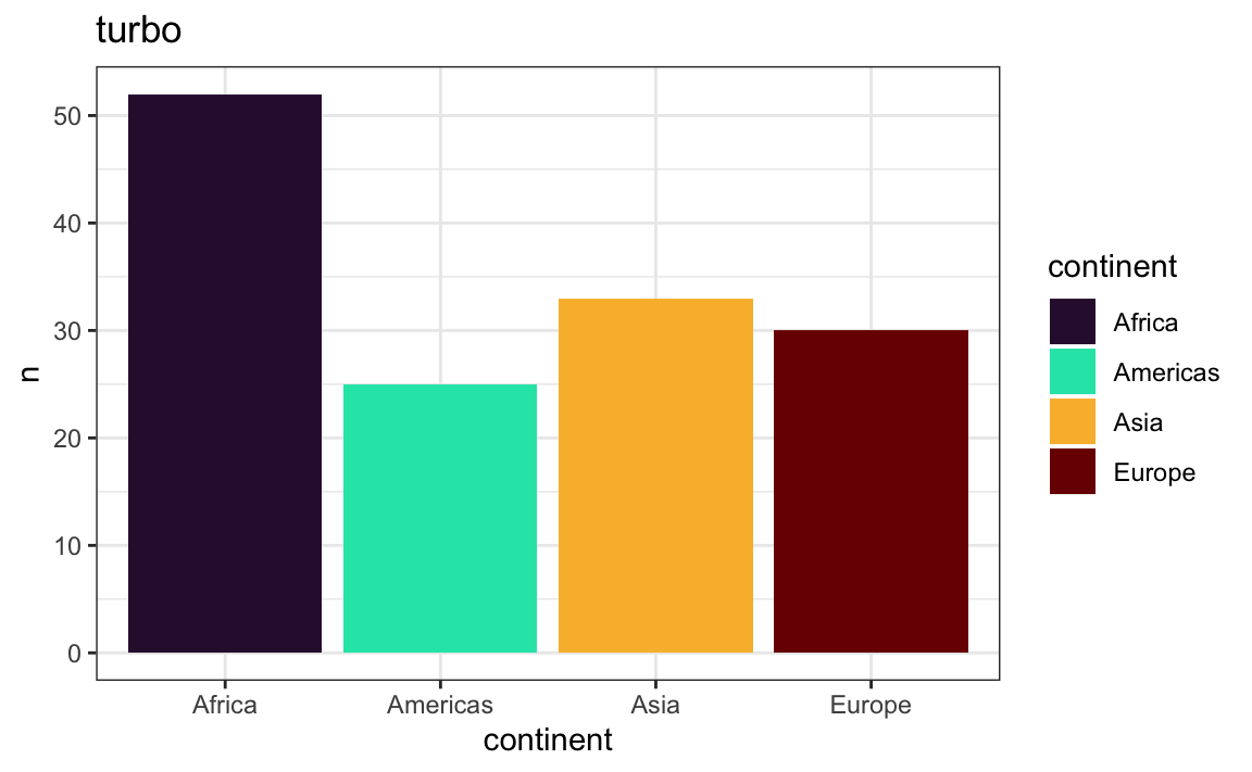
Some of the palettes are a little too light at the extremes, though, like magma, inferno, rocket, and mako:
ggplot(plot_data, aes(x = continent, y = n, fill = continent)) +
  geom_col() +
  scale_fill_viridis_d(option = "magma") +
  labs(title = "magma") +
  theme_bw()
ggplot(plot_data, aes(x = continent, y = n, fill = continent)) +
  geom_col() +
  scale_fill_viridis_d(option = "inferno") +
  labs(title = "inferno") +
  theme_bw()
ggplot(plot_data, aes(x = continent, y = n, fill = continent)) +
  geom_col() +
  scale_fill_viridis_d(option = "rocket") +
  labs(title = "rocket") +
  theme_bw()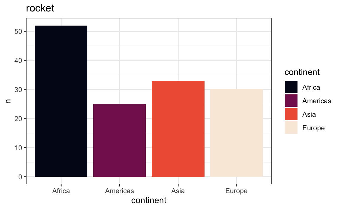
ggplot(plot_data, aes(x = continent, y = n, fill = continent)) +
  geom_col() +
  scale_fill_viridis_d(option = "mako") +
  labs(title = "mako") +
  theme_bw()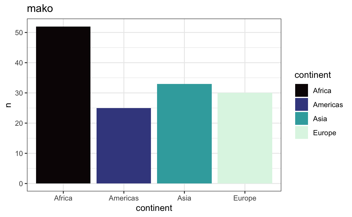
…while plasma’s final yellow is a little too neon-y for me:
ggplot(plot_data, aes(x = continent, y = n, fill = continent)) +
  geom_col() +
  scale_fill_viridis_d(option = "plasma") +
  labs(title = "plasma") +
  theme_bw()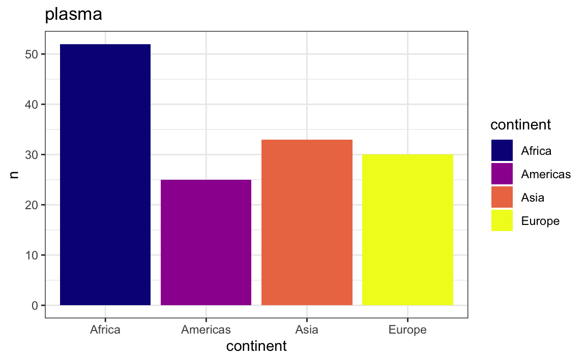
Fortunately it’s easy to fix these too-faded or too-neon colors. We can tell ggplot to change where it starts or stops cutting up the color palettes. We can use two different optional arguments in scale_fill_viridis_d() and scale_color_viridis_d(): begin and end, which control where to start and end the cutting process, in percentages.
In all the examples below, I arbitratily chose 80% as the ending point. There’s nothing special or magical about that. If anything, that’s probably too dark of an ending point. Each color map behaves a little differently, depending on the background of the panel (i.e. if you’re using the default gray background or something like theme_bw()), the amount of color in the plot (i.e. a big bar vs. a thin line), and so on.
In my own work, I typically end up with values like begin = 0.1, end = 0.9.
If we end at 0.8, we’ll truncate the palette and choose colors at 0%, 26.6%, 53.5%, and 80%, which will use a much darker color for the fourth color:
ggplot(plot_data, aes(x = continent, y = n, fill = continent)) +
  geom_col() +
  scale_fill_viridis_d(option = "magma", end = 0.8) +
  labs(title = "magma ending at 0.8") +
  theme_bw()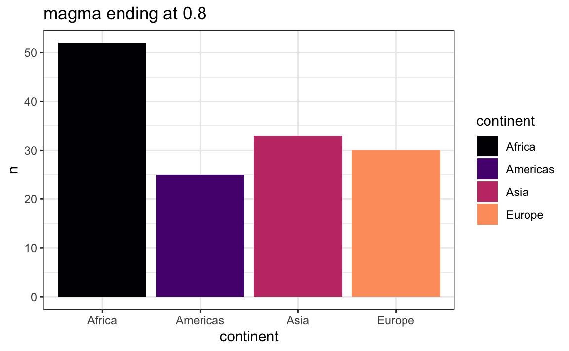
If you think the starting color is too dark, you can adjust the begin argument too. Starting at 10% and ending at 80% will select colors at 10%, 33.3%, 56.6%, and 80%:
ggplot(plot_data, aes(x = continent, y = n, fill = continent)) +
  geom_col() +
  scale_fill_viridis_d(option = "magma", begin = 0.1, end = 0.8) +
  labs(title = "magma beginning at 0.1 and ending at 0.8") +
  theme_bw()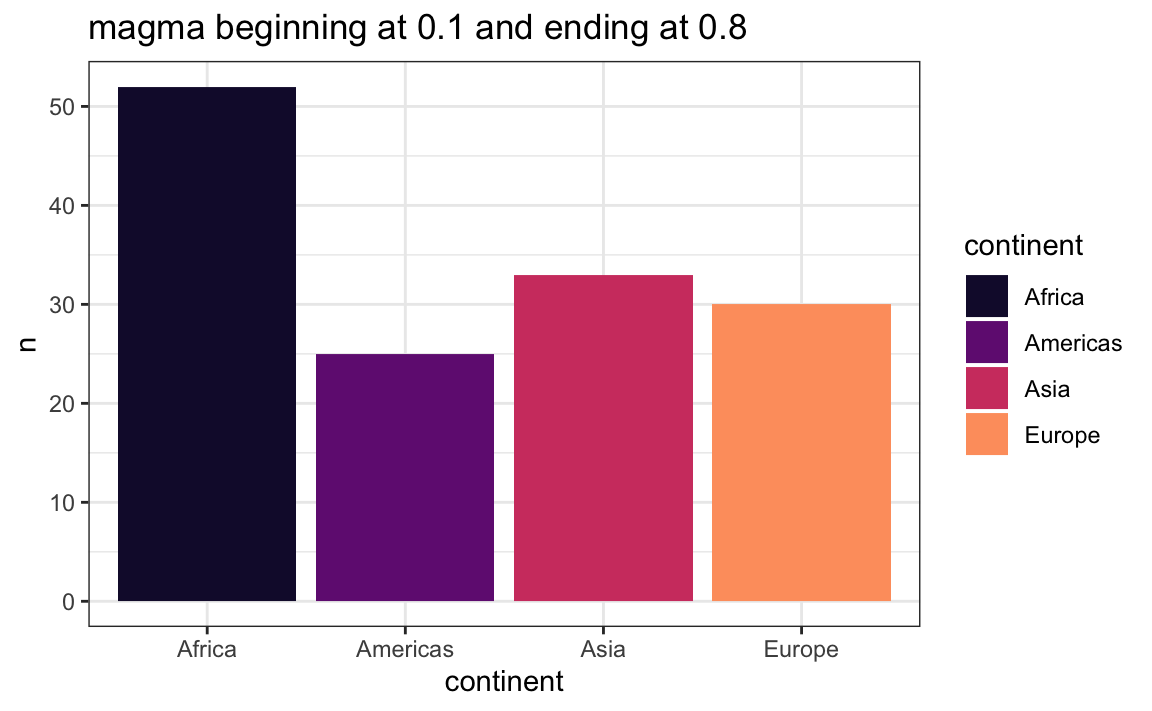
Much better!
This same approach works for the {scico} color maps too.
If you don’t want to truncate the color range, you can also try another approach—add a thin border around the bars:
ggplot(plot_data, aes(x = continent, y = n, fill = continent)) +
  geom_col(color = "black", linewidth = 0.2) +
  scale_fill_viridis_d(option = "magma") +
  labs(title = "magma with a border") +
  theme_bw()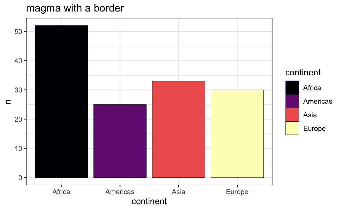
This is easy with area-based geoms like geom_col() and geom_histogram(), since those can take both fill (inside of the bar) and color (border of the bar) aesthetics.
If you’re using geom_point(), though, those shapes by default only use the color aesthetic. Fill doesn’t do anything:
Phew, those European points are really hard to see
gapminder |>
  filter(year == 2002, continent != "Oceania") |>
  ggplot(aes(x = gdpPercap, y = lifeExp, color = continent)) +
  geom_point(size = 2) +
  scale_x_log10() +
  scale_color_viridis_d(option = "magma") +
  labs(title = "magma") +
  theme_bw()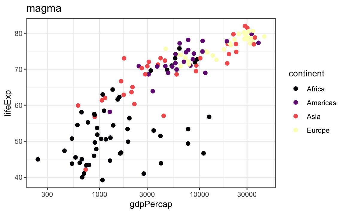
If we fill by continent, the points are all the same. By default, point shapes can only be colored, not filled.
gapminder |>
  filter(year == 2002, continent != "Oceania") |>
  ggplot(aes(x = gdpPercap, y = lifeExp, fill = continent)) +
  geom_point(size = 2) +
  scale_x_log10() +
  scale_fill_viridis_d(option = "magma") +
  labs(title = "magma") +
  theme_bw()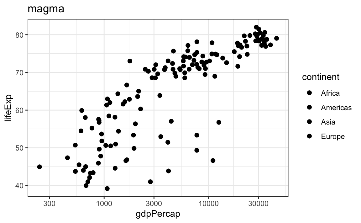
R and ggplot have 26 possible shapes that you can use, and they’re numbered 0–25. You can see what they are in the documentation if you run ?pch in the console, which (maybe??) stands for “point character” (I think??):

The default shape for geom_point() is 19, which is a solid circle. The shapes 0–14 are all hollow, while shapes 15–20 are solid, and they all are controlled with the color aesthetic. Notice how shapes 21–25 are filled with gray, though? That’s because they’re special. Those shapes can have both color and fill—color controls the border (or stroke), while fill controls the inside.
If you tell geom_point() to use shape 21 (or any of 21–25), you can use both color and fill. If you fill by continent and add a thin black border/stroke around the points, the pale yellow in magma is much more visible and usable:
gapminder |>
  filter(year == 2002, continent != "Oceania") |>
  ggplot(aes(x = gdpPercap, y = lifeExp, fill = continent)) +
  # The stroke argument here controls the thickness of the border
  geom_point(size = 2, shape = 21, color = "black", stroke = 0.25) +
  scale_x_log10() +
  scale_fill_viridis_d(option = "magma") +
  labs(title = "magma") +
  theme_bw()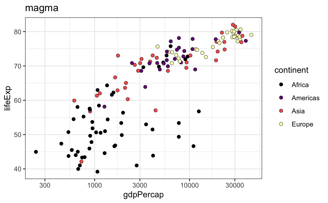
Some of the words in my word frequency/tf-idf plot were out of order—how can I fix that?
In the example for session 14, I showed the 15 most frequent words in Hamlet, Macbeth, Romeo and Juliet, and King Lear, faceted by play. Only Romeo and Juliet, though, has the words in the correct order. The other plays have strange ordering. Note how “lord” and “king” are weirdly misplaced in Macbeth and Hamlet and how “love” is weirdly misplaced in Hamlet:
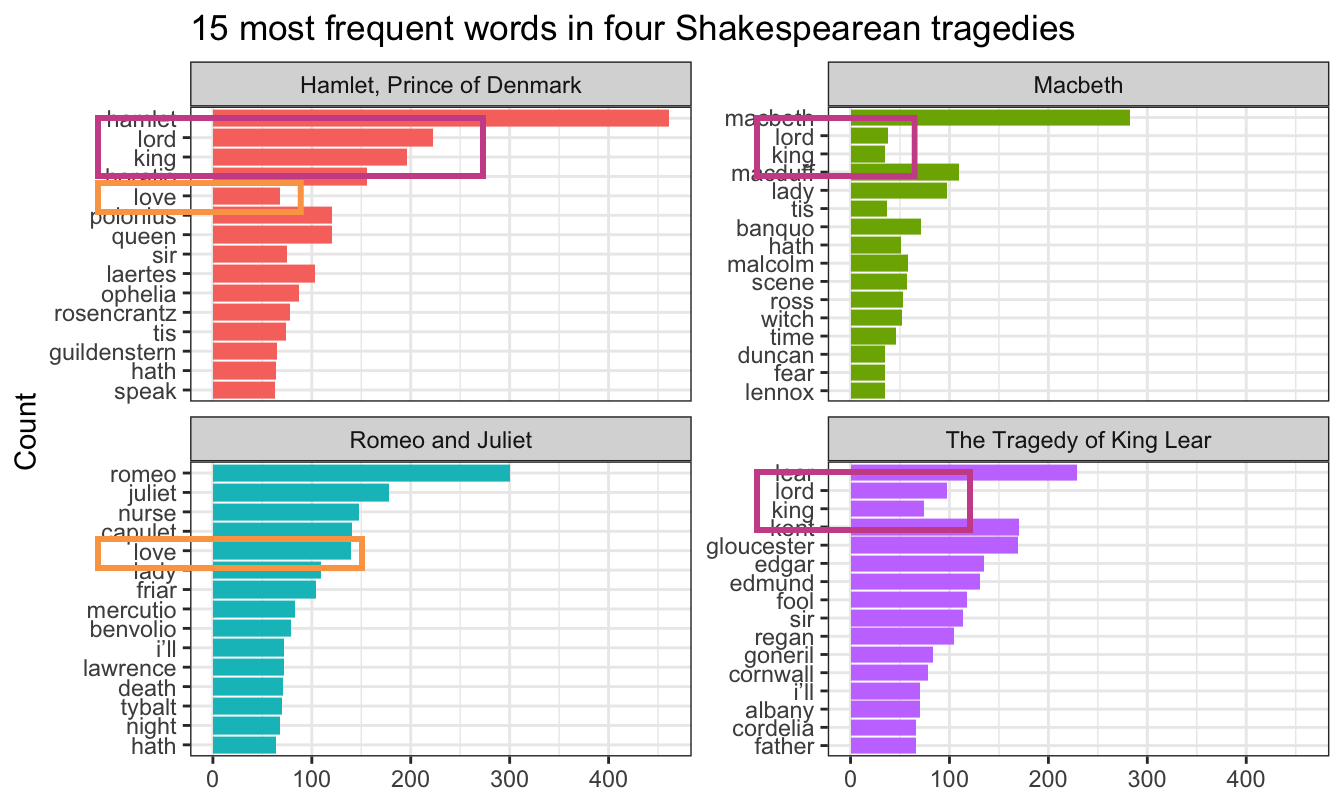
The word “lord” is the second most common word in Hamlet, so R thinks it is the second most common word across all the plays. It doesn’t know that there’s a difference between “lord” in Hamlet and “lord” in Macbeth. As a result, any common words that are shared across the plays will appear out of order.
This is fixable though! See this blog post by Julia Silge, one of the authors of {tidytext}. Basically, you need to use reorder_within() to sort the words correctly inside each play, then add scale_y_reordered() to make them display correctly.
Here’s what that looks like with the Shakespeare words.
library(tidyverse)
library(gutenbergr)  # For getting books from Project Gutenberg
library(tidytext)    # For working with text
tragedies_raw <- gutenberg_download(
c(
1524, # Hamlet
1532, # King Lear
1533, # Macbeth
1513 # Romeo and Juliet
),
meta_fields = "title"
)# Clean up the tragedies text
top_words_tragedies <- tragedies_raw |>
drop_na(text) |>
unnest_tokens(word, text) |>
# Remove stop words
anti_join(stop_words) |>
# Get rid of old timey words and stage directions
filter(!(word %in% c("thou", "thy", "haue", "thee",
"thine", "enter", "exeunt", "exit"))) |>
# Count all the words in each play
count(title, word, sort = TRUE) |>
# Keep top 15 in each play
group_by(title) |>
top_n(15) |>
ungroup()
top_words_tragedies
## # A tibble: 62 × 3
## title word n
## <chr> <chr> <int>
## 1 Hamlet, Prince of Denmark hamlet 461
## 2 Romeo and Juliet romeo 300
## 3 Macbeth macbeth 282
## 4 The Tragedy of King Lear lear 229
## 5 Hamlet, Prince of Denmark lord 223
## 6 Hamlet, Prince of Denmark king 196
## 7 Romeo and Juliet juliet 178
## 8 The Tragedy of King Lear kent 170
## 9 The Tragedy of King Lear gloucester 169
## 10 Hamlet, Prince of Denmark horatio 156
## # ℹ 52 more rowsBecause we used top_n(), these words are already sorted in order of frequency (with “hamlet” appearing the most at 461 times). In example 14, we locked in that order by making the word column an ordered factor, like this:
top_words_tragedies_order_wrong <- top_words_tragedies |>
  # Make the words an ordered factor so they plot in order
  mutate(word = fct_inorder(word))

ggplot(top_words_tragedies_order_wrong, aes(y = fct_rev(word), x = n, fill = title)) +
  geom_col() +
  guides(fill = "none") +
  labs(y = "Count", x = NULL,
       title = "15 most frequent words in four Shakespearean tragedies") +
  facet_wrap(vars(title), scales = "free_y") +
  theme_bw()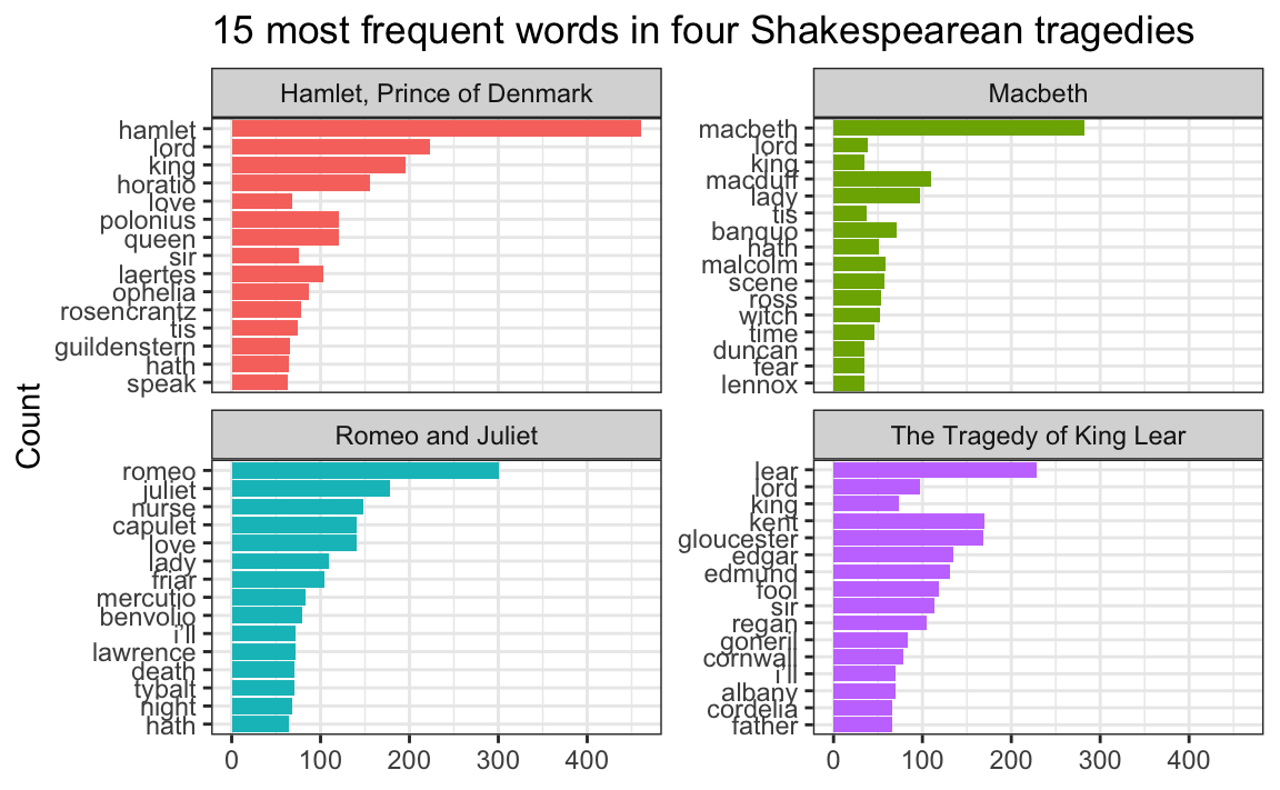
But that’s wrong!
Instead of using fct_inorder(), we need to use reorder_within() and tell it to sort the words by count within each play:
top_words_tragedies_order_right <- top_words_tragedies |>
  # Make the words an ordered factor so they plot in order
  mutate(word = reorder_within(word, n, title))

top_words_tragedies_order_right
## # A tibble: 62 × 3
##    title                     word                                      n
##    <chr>                     <fct>                                 <int>
##  1 Hamlet, Prince of Denmark hamlet___Hamlet, Prince of Denmark      461
##  2 Romeo and Juliet          romeo___Romeo and Juliet                300
##  3 Macbeth                   macbeth___Macbeth                       282
##  4 The Tragedy of King Lear  lear___The Tragedy of King Lear         229
##  5 Hamlet, Prince of Denmark lord___Hamlet, Prince of Denmark        223
##  6 Hamlet, Prince of Denmark king___Hamlet, Prince of Denmark        196
##  7 Romeo and Juliet          juliet___Romeo and Juliet               178
##  8 The Tragedy of King Lear  kent___The Tragedy of King Lear         170
##  9 The Tragedy of King Lear  gloucester___The Tragedy of King Lear   169
## 10 Hamlet, Prince of Denmark horatio___Hamlet, Prince of Denmark     156
## # ℹ 52 more rows
Notice how the word column looks a little weird now. It added the play name to the end of each word, like macbeth___Macbeth. That’s actually a creative hack for fixing the ordering. Remember that the main reason the ordering is messed up across facets is because R doesn’t know that the word “love” in Hamlet is different from the word “love” in Romeo and Juliet. By changing the words to love___Romeo and Juliet and love___Hamlet, R can now recognize the different versions of “love” and sort them correctly. Let’s plot this version:
ggplot(top_words_tragedies_order_right, aes(y = word, x = n, fill = title)) +
  geom_col() +
  guides(fill = "none") +
  labs(y = "Count", x = NULL,
       title = "15 most frequent words in four Shakespearean tragedies") +
  facet_wrap(vars(title), scales = "free_y") +
  theme_bw()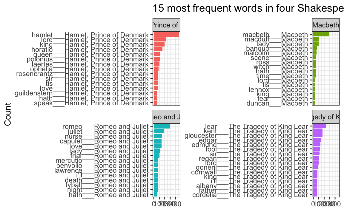
oh no.
The order is right (yay!) but the y-axis is horrible since it’s including the hacky ___play name at the end of each of the words.
To fix that, we can use scale_y_reordered(), which cleans up those word labels by removing the three underscores and any text that follows them:
ggplot(top_words_tragedies_order_right, aes(y = word, x = n, fill = title)) +
  geom_col() +
  scale_y_reordered() +
  guides(fill = "none") +
  labs(y = "Count", x = NULL,
       title = "15 most frequent words in four Shakespearean tragedies") +
  facet_wrap(vars(title), scales = "free_y") +
  theme_bw()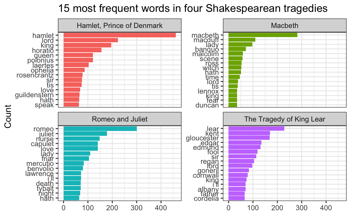
Perfect!
Cleaning up text is always specific and specialized
In the Shakespeare example, we removed common stop words like “the” and “a” with anti_join() and then manually removed some other more specific words like “thou” and “thee” and “exit”:
# Clean up the tragedies text
top_words_tragedies <- tragedies_raw |>
  drop_na(text) |>
  unnest_tokens(word, text) |>
  # Remove stop words
  anti_join(stop_words) |>
  # Get rid of old timey words and stage directions
  filter(!(word %in% c("thou", "thy", "haue", "thee",
                       "thine", "enter", "exeunt", "exit")))
That’s because in these specific plays, those are common words that we want to ignore—they’re basically our own custom stop words. We should also probably get rid of words like “act” and “scene” too, but we didn’t here.
Many of you kept that exact code in exercise 14, removing “thou”, “thy”, “exeunt”, and those other words from your own text. But that’s not necessary or helpful. If you’re working with something like Harry Potter or Jane Austen or Ernest Hemmingway or anything more modern than Shakespeare, those words aren’t really in there. In the Shakespeare example, we removed “enter” and “exit” because those are stage directions, but in other books those are regular actual words and probably shouldn’t be removed.
There’s no one universal set of stop words that you can use—every text is unique and has its own quirks that you need to take care of.
For example, one of you looked at four books by W. E. B. Du Bois and did this to clean up the stop words:
dubois_clean |>
  anti_join(stop_words) |>
  filter(!(word %in% c("1", "2", "cong", "sess", "act", "pp", "_ibid",
                       "_house", "3", "doc")))
That’s awesome. Those are all words that are specific to those four books and that were likely appearing in the frequency plot. One (or more) of the books probably mentioned lots of congressional activity, like congressional sessions, acts of congress, stuff happening in the House of Representatives, and so on. There were probably also a lot of citations, with things like “pp.” (the abbreviation for “pages”, like “pp. 125-127”) and “ibid” (the abbreviation for “see the previous citation”). That list of words is specific to those four books and should not be applied to other books—like, there’s no reason to remove those words from the Shakespeare tragedies or from Little Women or from Harry Potter because none of those mention congressional sessions or use “ibid”.
Data cleaning is always context specific.