Reminder! The final deadline for all assignments other than the final project is Tuesday, December 10 at 11:59 PM (details)
Color palettes
Categories of color palettes
When choosing colors, you need to make sure you work with a palette that mathches the nature of your data. There are three broad categories of color-able data: sequential, diverging, and qualitative.
Here’s are three plots I’ll use throughout this page to illustrate their differences (and show off different colors). The code is hidden to save space—you can show the code and copy/paste it if you want to follow along:
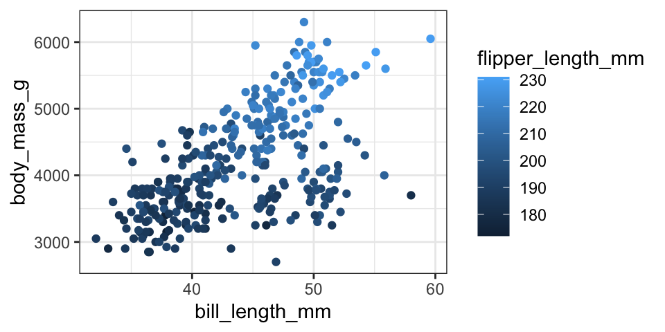
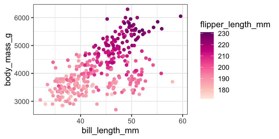
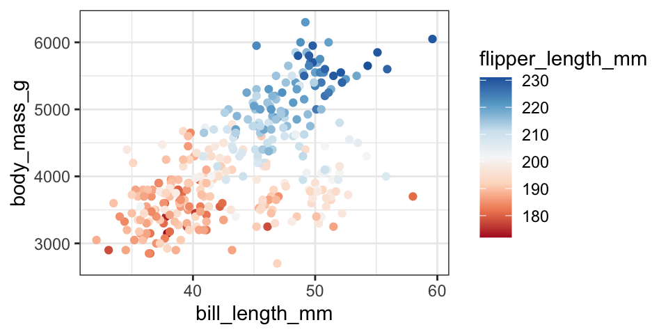
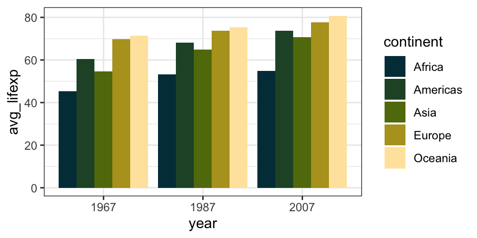
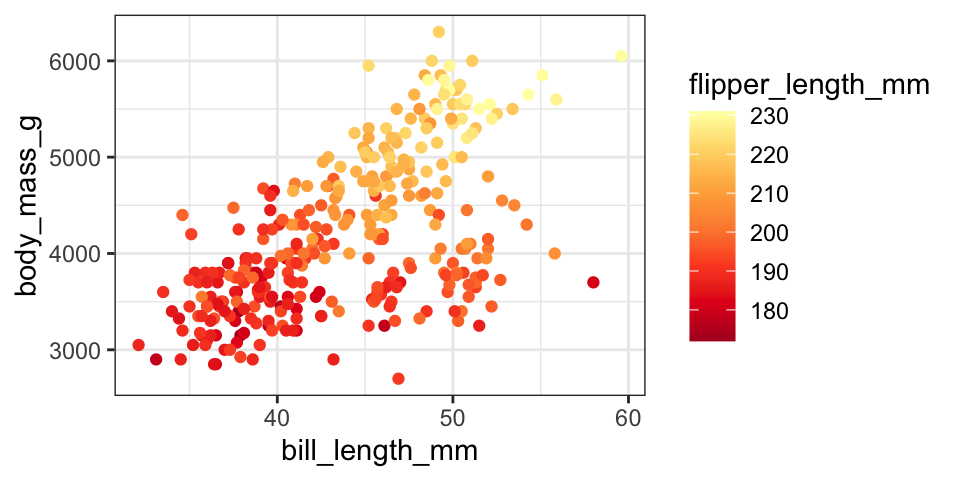
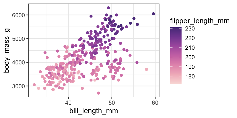
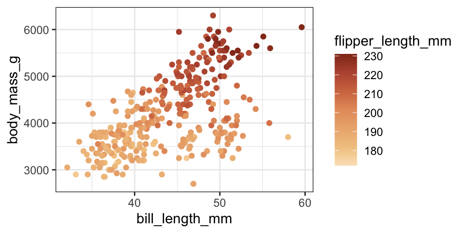
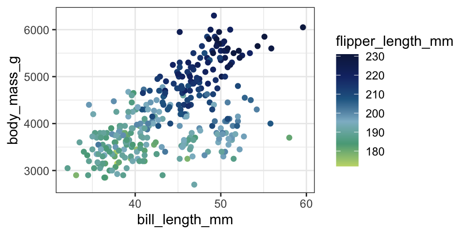
With sequential data, colors represent a range from low value to a high value, so the colors either stay within one shade or hue of a color, or use multiple related hues
plot_sequential +scale_color_distiller(palette ="RdPu", direction =1)
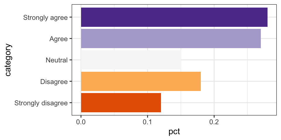
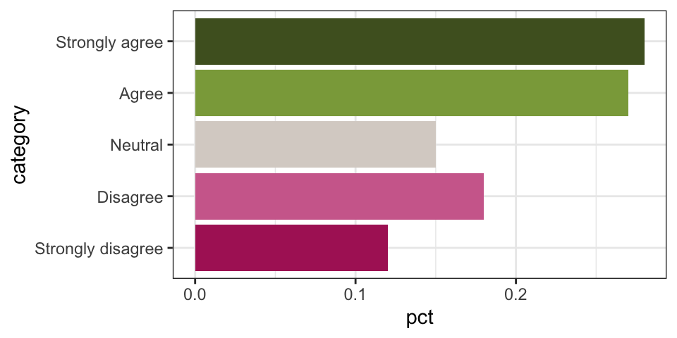
Diverging
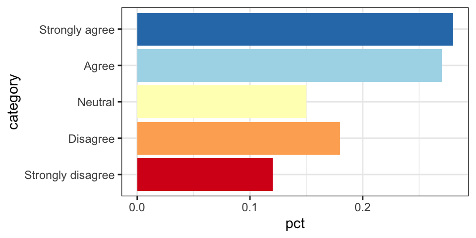
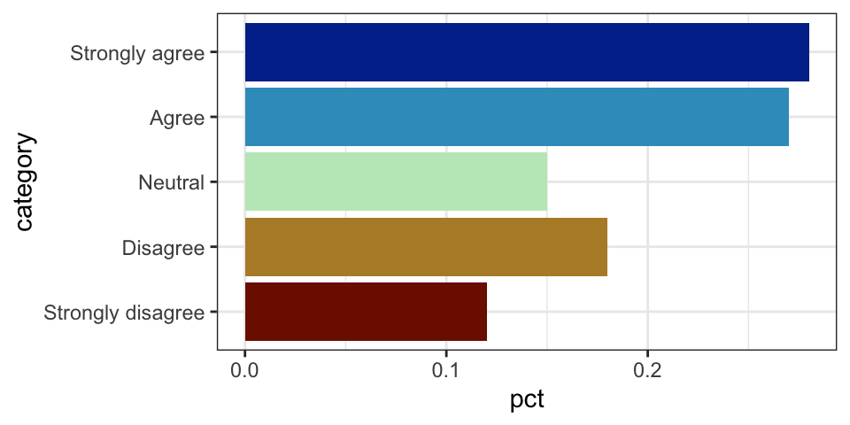
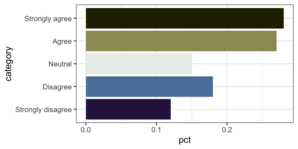
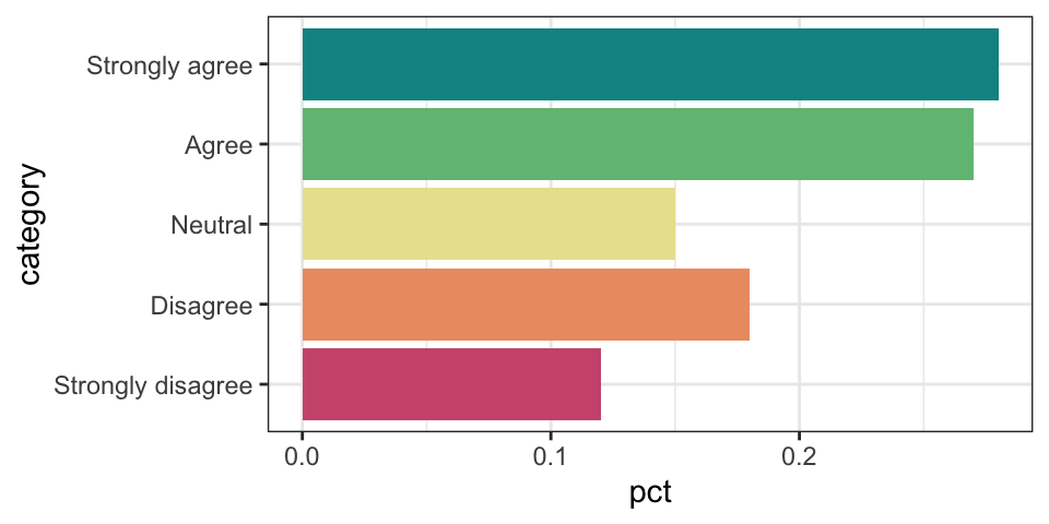
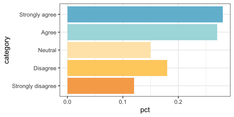
With diverging data, colors represent values above and below some central value, like negative to zero to positive; disagree to neutral to agree; etc. These palettes typically involve three colors: two for the extremes and one for the middle
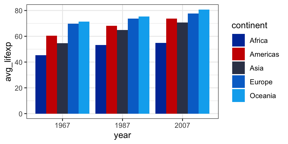
By default, ggplot doesn’t actually do anything with diverging scales. If you have numeric data, it’ll use a blue gradient; if you have categorical data, it’ll use distinct colors. You’re in charge of applying a diverging palette.
# This doesn't show up as divergingplot_diverging
plot_diverging +scale_fill_brewer(palette ="RdYlBu", direction =1)
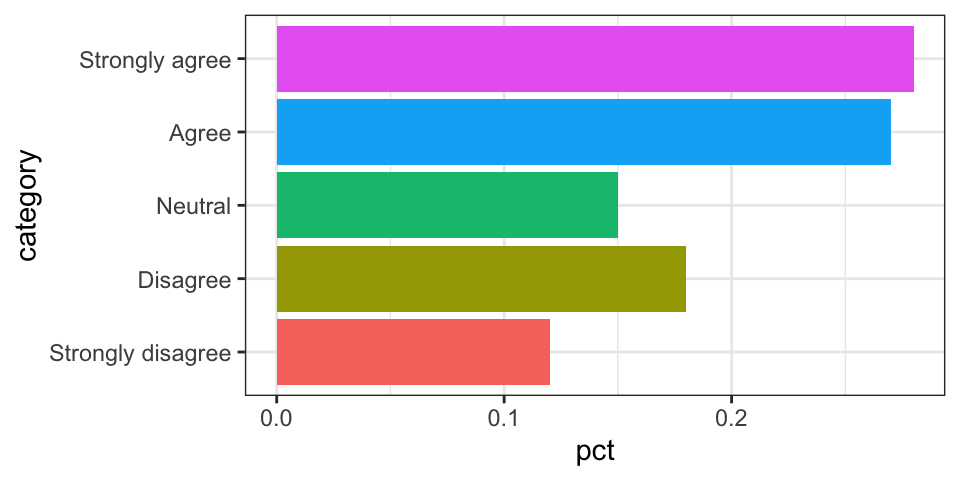
Don’t use diverging palettes for non-diverging data!
People will often throw diverging palettes onto plots that aren’t actually diverging, like this:
plot_sequential +scale_color_distiller(palette ="RdBu", direction =1)
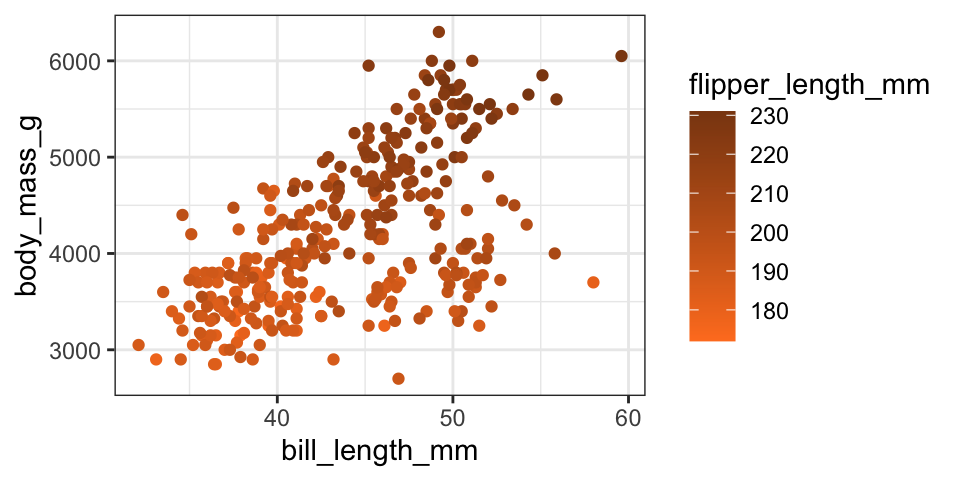
Don’t do this! It looks weird having 200 be a super-faded middle color. Flipper length here ranges from a low number to a high number—the colors should reflect that.
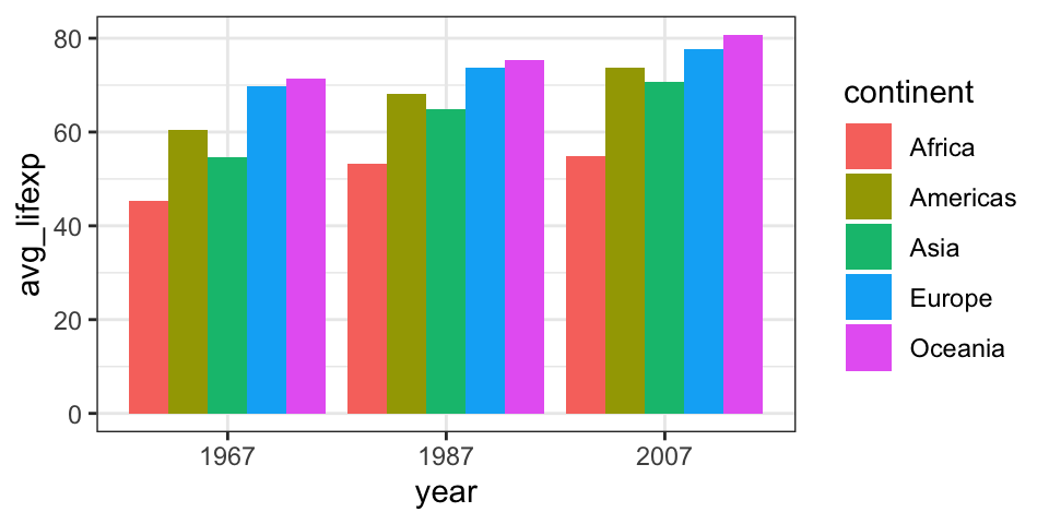
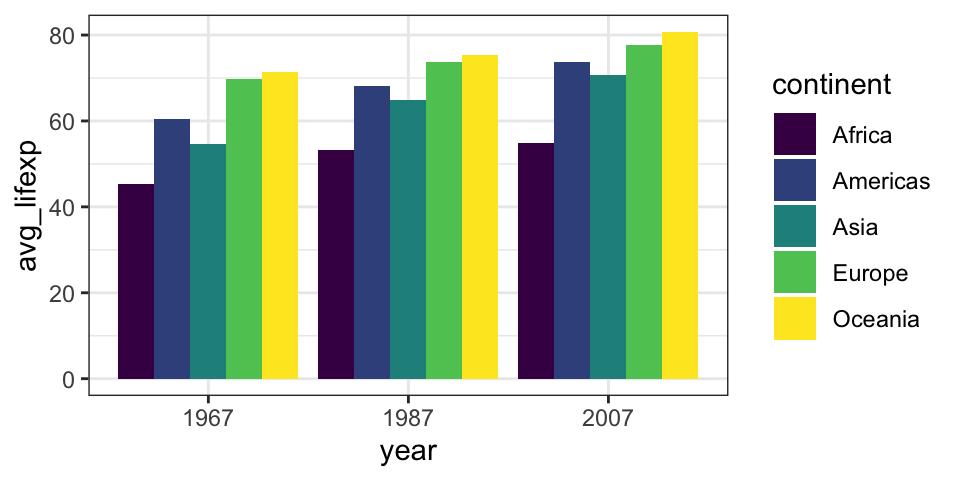
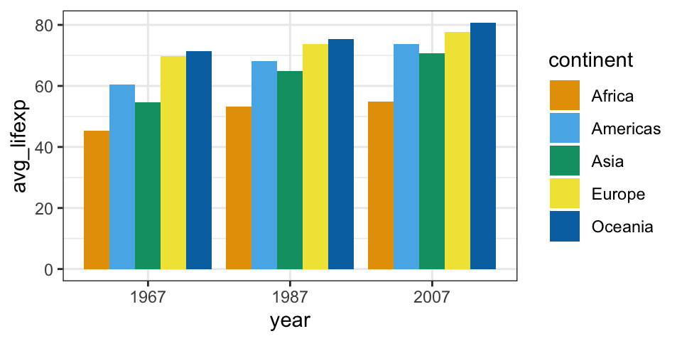
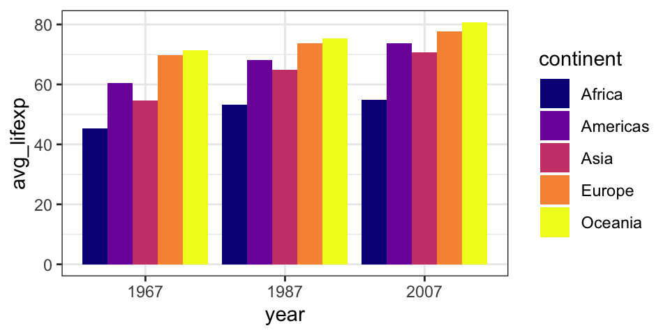
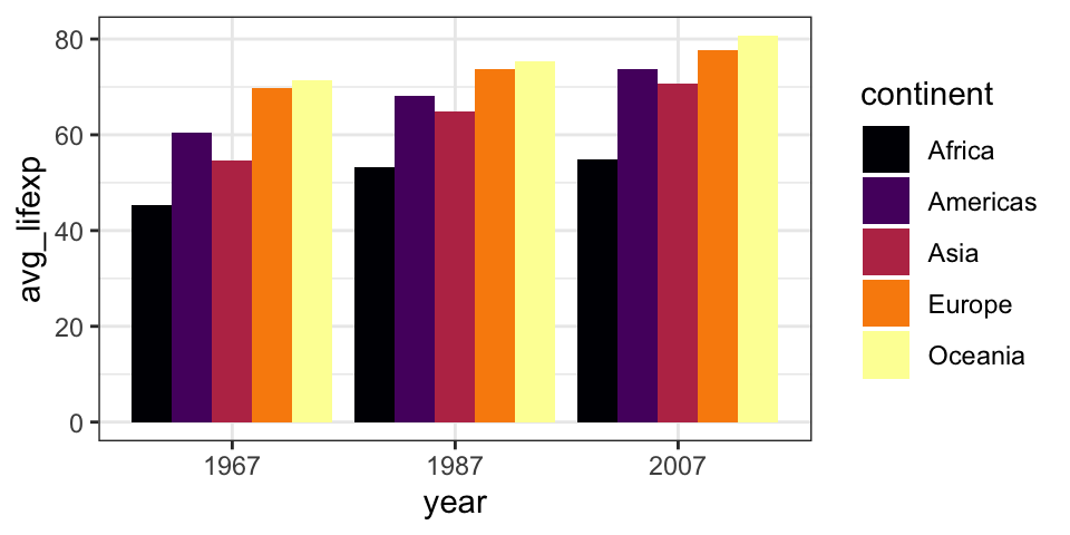
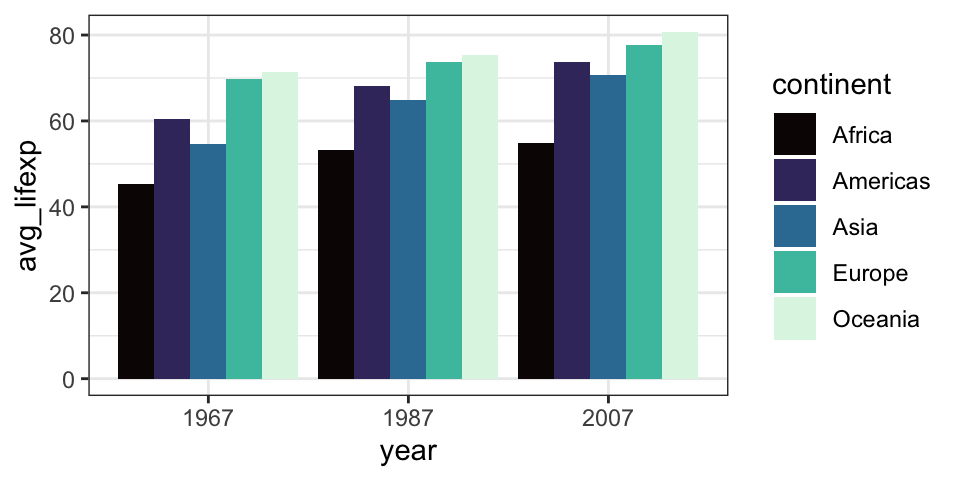
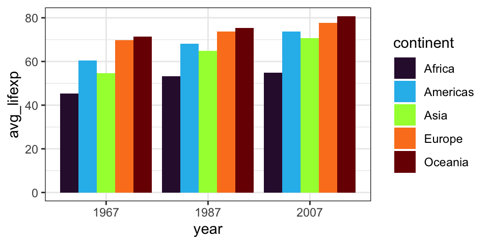
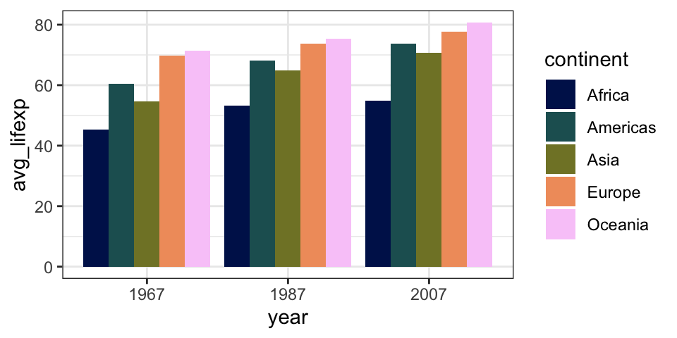
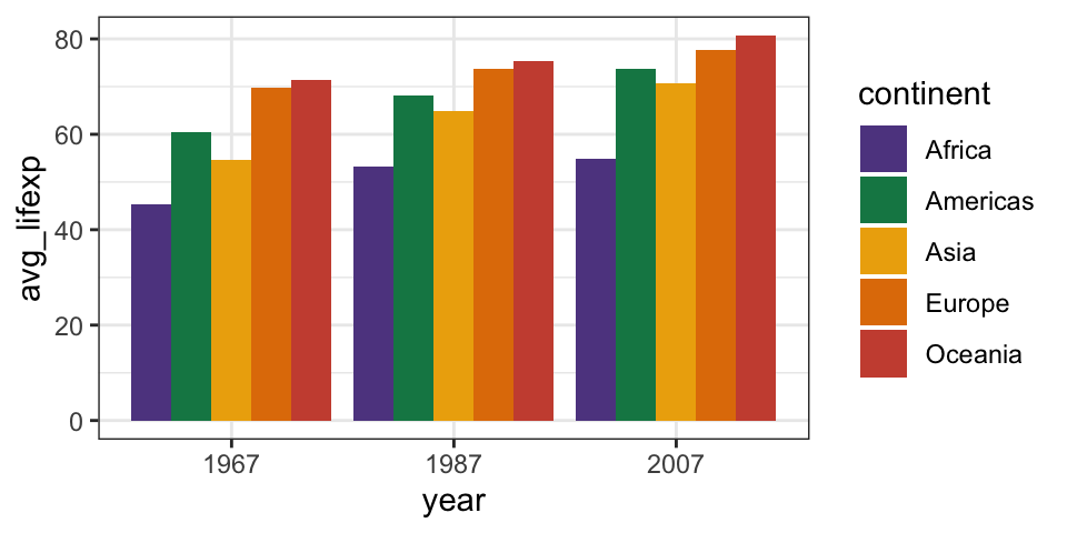
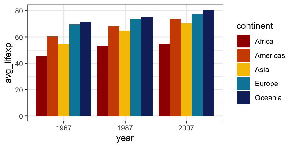
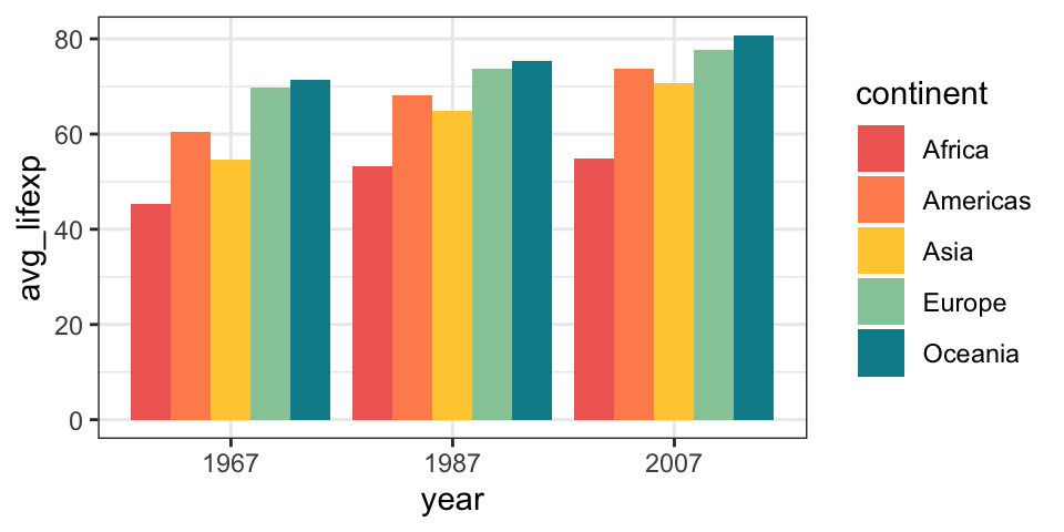
Qualitative
With qualitative data, colors represent distinct categories and don’t have an inherent order. The colors shouldn’t look like they have a natural progression.
You can use any custom colors with scale_fill_manual()/scale_color_manual() (for qualitative/categorical colors) or scale_fill_gradident()/scale_color_gradient() (for sequential/continuous colors).
plot_sequential +scale_color_gradient(low ="chocolate1", high ="chocolate4")
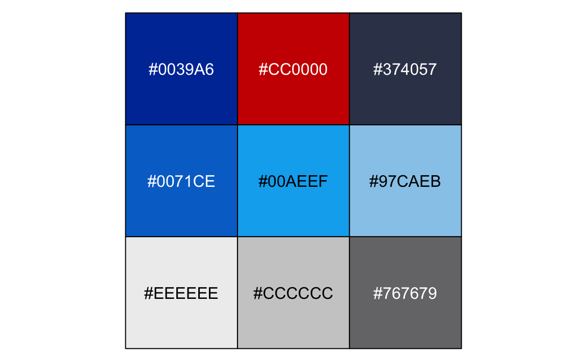
Often organizations have specific color palettes that you’re supposed to use. For instance, GSU has a special “Georgia State Blue” (■#0039A6) and a red accent (■#CC0000). The Urban Institute has a specific organizational color palette with all sorts of guidelines for comparing two groups, three groups, sequential data, diverging data, and other special situations. They have specific red and blue colors to use for political parties too, like ■#1696d2 for Democrats and ■#db2b27 for Republicans.
I often find it helpful to make a little object that contains all the custom colors I want to use so I don’t have to remember what the cryptic hex codes mean. Here’s GSU’s full palette:
Perceptually uniform and scientifically calibrated palettes
You aren’t limited to just the default ggplot color palettes, or even the default viridis palettes. There are lots of other perceptually uniform palettes that use special ranges of color that can either (1) be used as a sequential gradient or (2) be chopped up into equal distances to create recognizable distinct colors.
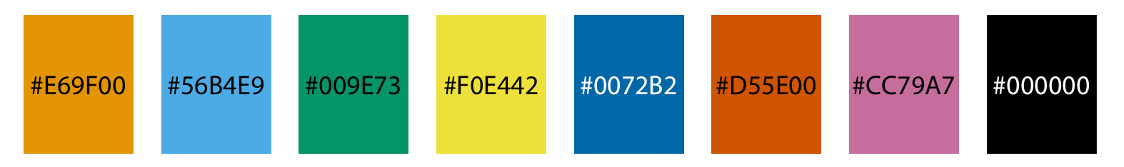
You can use it with the {ggokabeito} package and scale_fill_okabe_ito()/scale_color_okabe_ito():
plot_qualitative +scale_fill_okabe_ito()
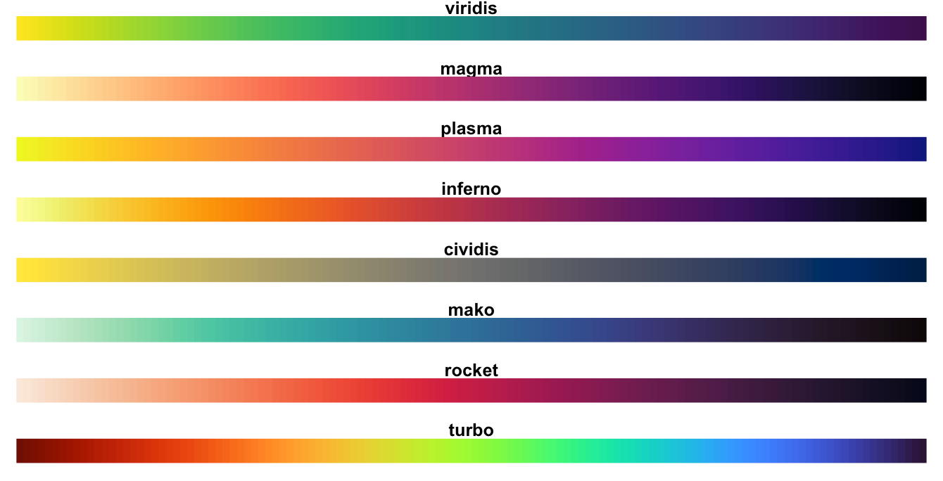
viridis
You’ve seen the regular green/blue/yellow viridis palette throughout the class, but there are are a bunch of other palettes within viridis like magma, plasma, inferno, mako, rocket, and turbo.
None of the viridis palettes are diverging, but they work great for both sequential and qualitative data.
The viridis palettes come with {ggplot2} and you can use them with scale_fill_viridis_d()/scale_color_viridis_d() for discrete data and scale_fill_viridis_c()/scale_color_viridis_c() for continuous data.
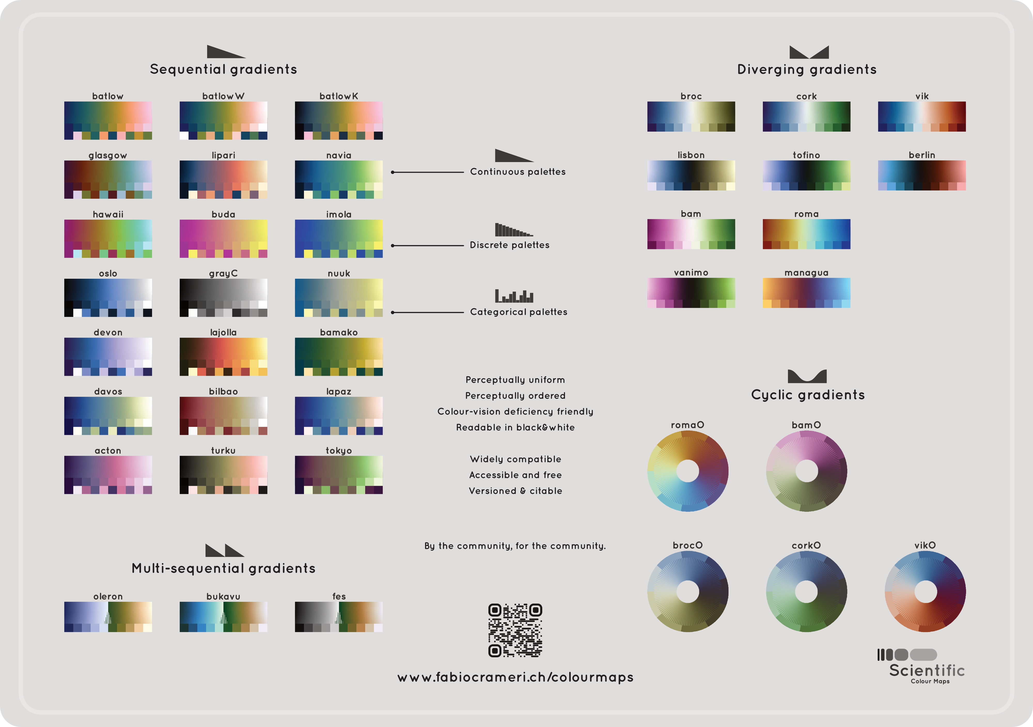
The {scico} package provides a ton of other similar well-designed palettes from the Scientific Colour Maps project. The project includes sequential, diverging, and qualitative palettes and even has multi-sequential and cyclic palettes.
After loading the {scico} package, you can use these palettes with scale_fill_scico_d()/scale_color_scico_d() for discrete data and scale_fill_scico_c()/scale_color_scico_c() for continuous data.
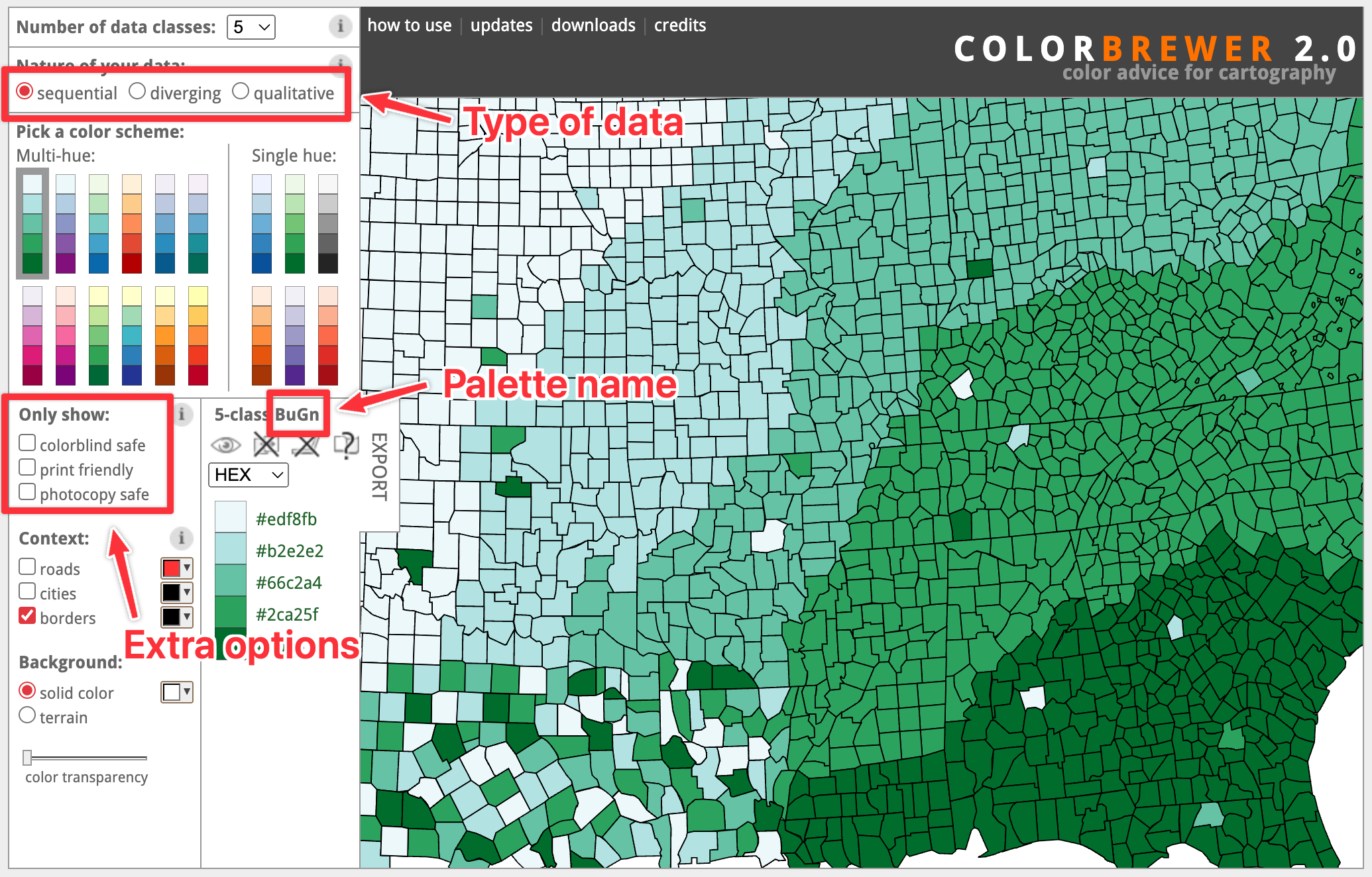
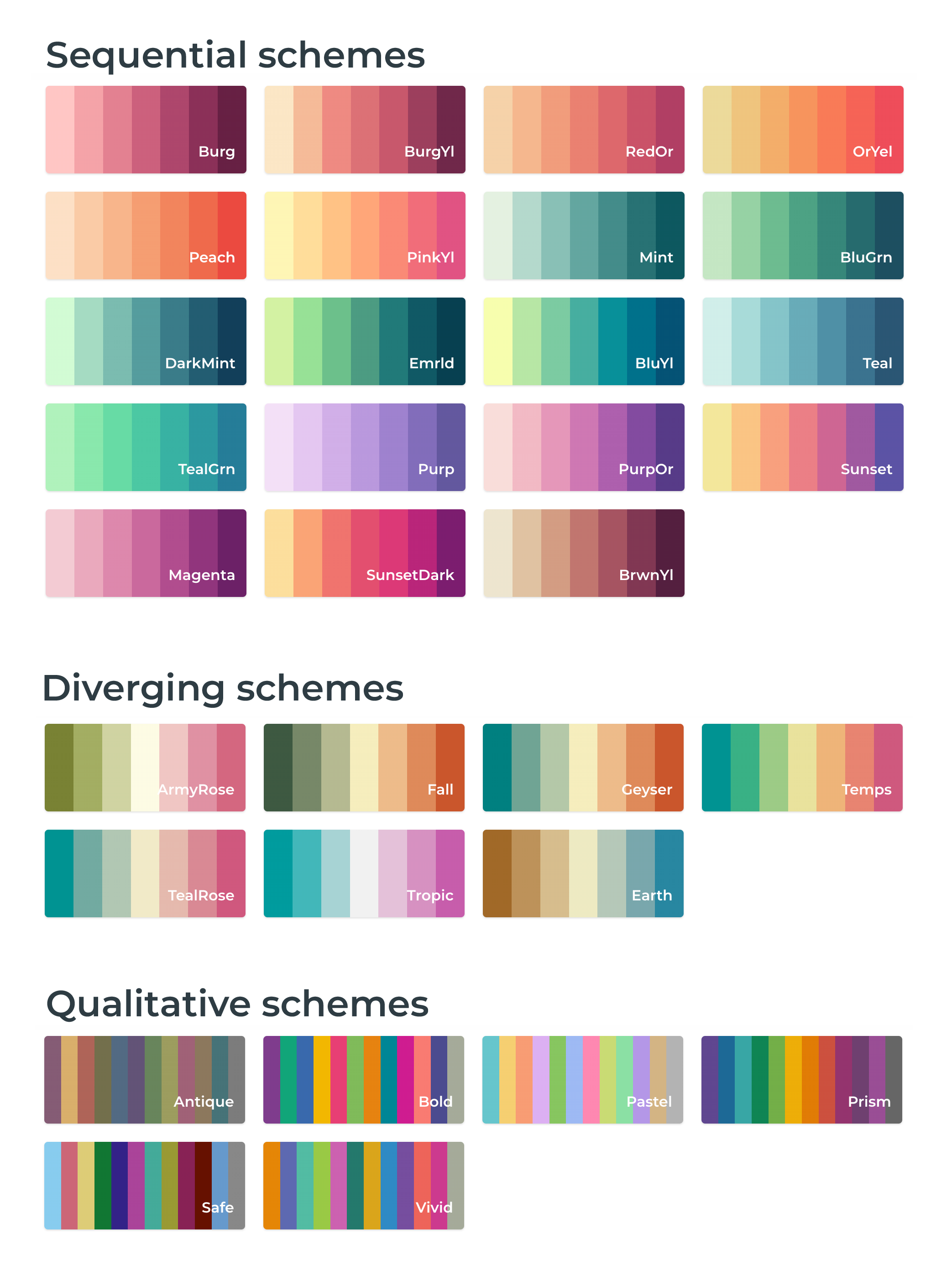
Geographer Cynthia Brewer developed a set of color palettes designed specifically for improving the readability of maps, but her palettes work incredibly well for regular plots too. There’s also a fantastic companion website for exploring all the different palettes, categories by sequential/diverging/qualitatitve, with options to filter by colorblind friendliness and print friendliness.
To use one of the palettes, note what it’s called at the website and use that name as the palette argument. The ColorBrewer palettes come with {ggplot2} and you can use them with scale_fill_brewer()/scale_color_brewer() for discrete data and scale_fill_distiller()/scale_color_distiller() for continuous data.
The commerical GIS service CARTO created CARTOColors: a set of open source geographic-like colors just like ColorBrewer. Again, these were originally designed for maps, but they work great for regular data visualization too.
You’ll need to install the {rcartocolor} package to use them. After loading {rcartocolor}, you can use any of the palettes with scale_fill_carto_d()/scale_color_carto_d() for discrete data and scale_fill_carto_c()/scale_color_carto_c() for continuous data. Use the name of the palette at the CARTOColors website in the palette argument.
plot_diverging +scale_fill_carto_d(palette ="Temps", direction =-1)
# Extract 5 colors from the Prism palette and use them with scale_fill_manual()clrs <-carto_pal(12, "Prism")plot_qualitative +scale_fill_manual(values = clrs[c(1, 4, 6, 7, 8)])
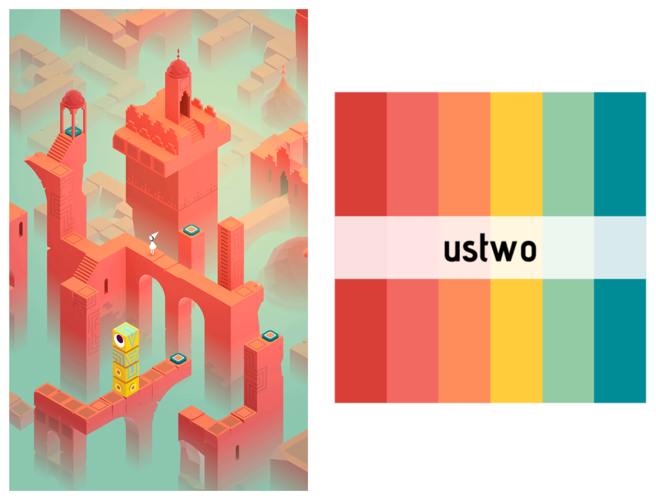
Fun and artsy (but still useful!) palettes
There are also palettes that are hand-picked for beauty and/or fun. Not all of these are perceptually uniform or colorblind friendly, but they’re great for when you want to have pretty graphics that fit a certain vibe.
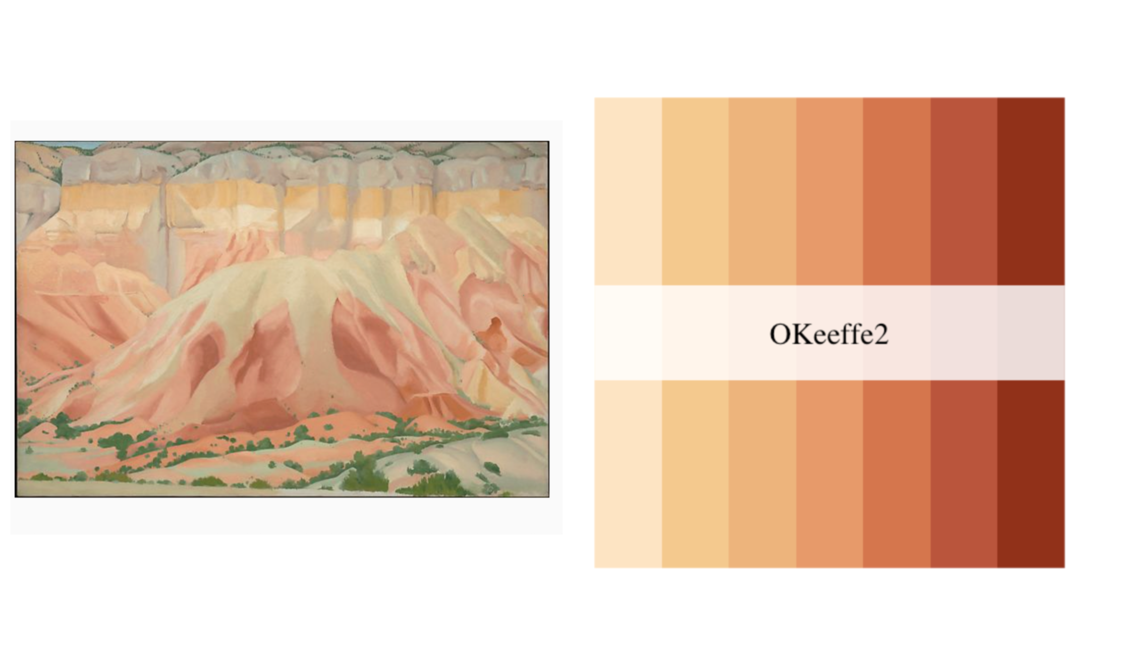
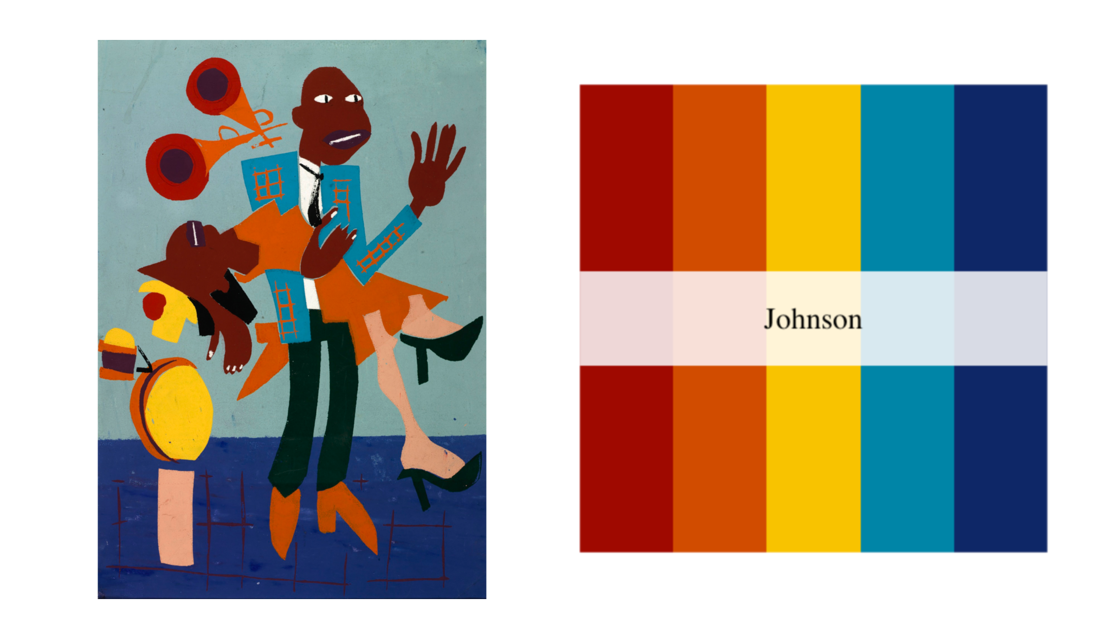
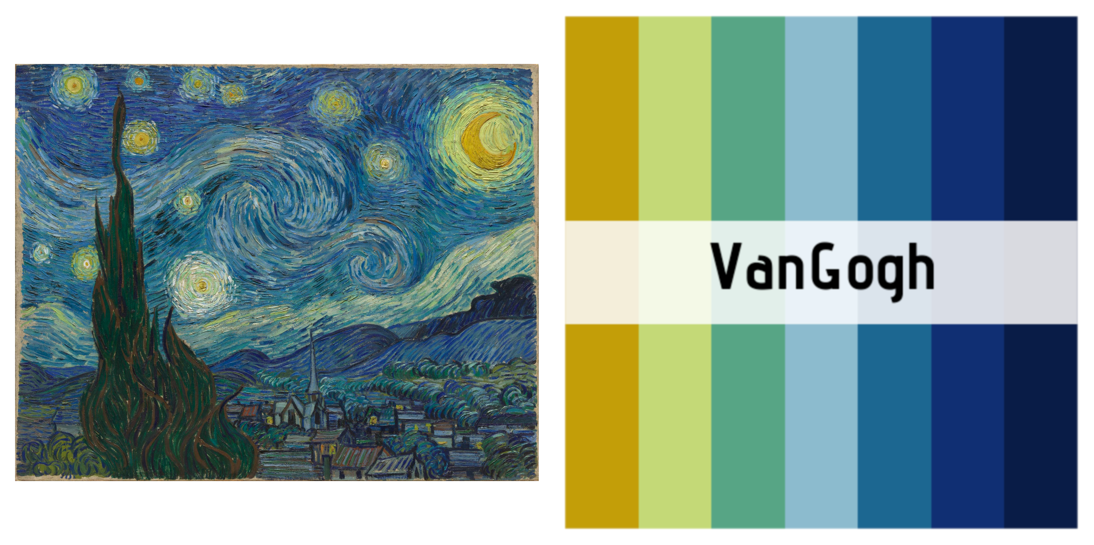
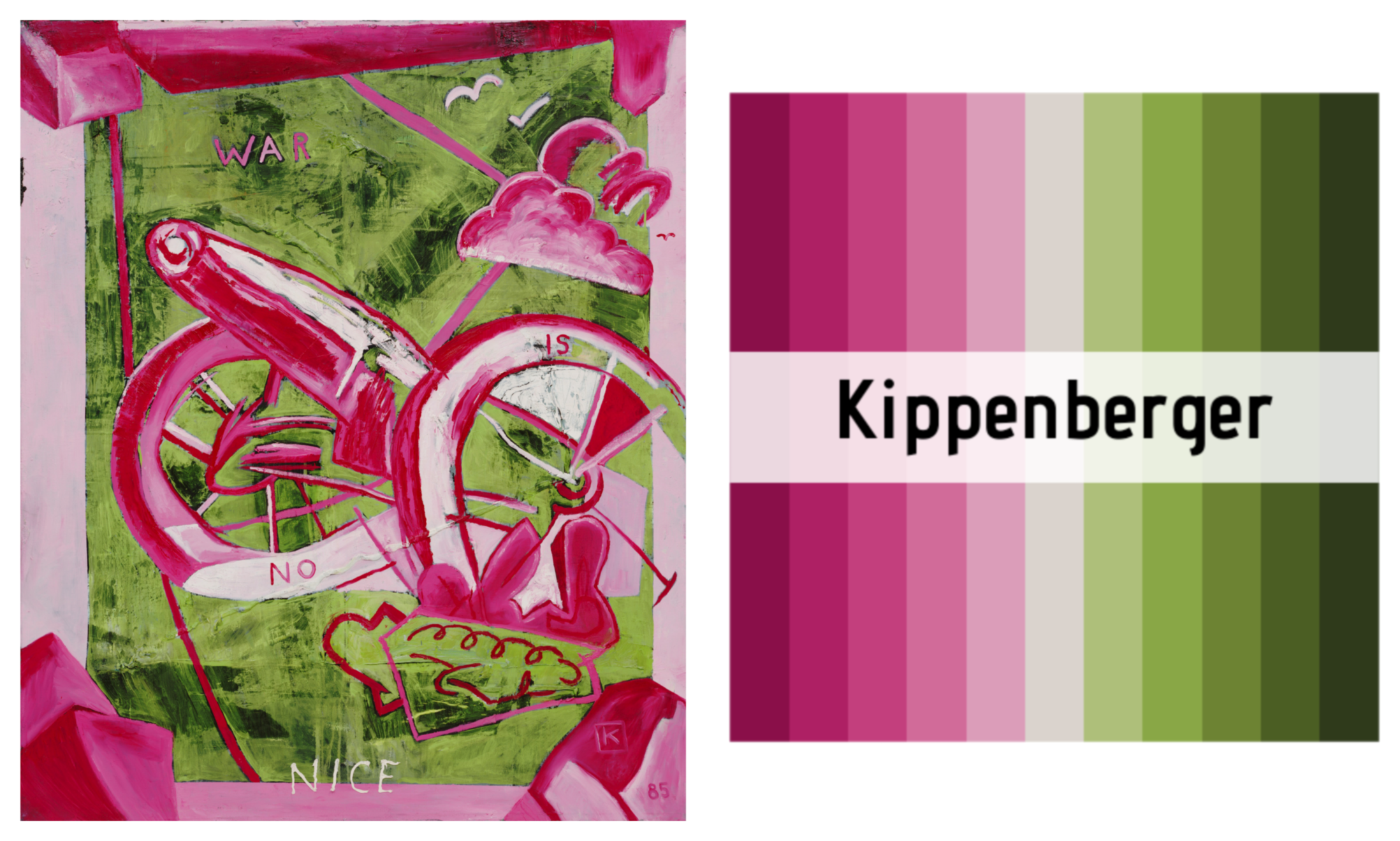
Literal art: {MetBrewer} and {MoMAColors}
Use palettes inspired by works in the Metropolitan Museum of Art and the Museum of Modern Art in New York. There are sequential, diverging, and qualitative palettes, and many are marked as colorblind friendly in {MetBrewer} and {MoMAColors}
Use them by putting met.brewer() or moma.colors() inside scale_fill_manual()/scale_color_manual() or scale_fill_gradientn()/scale_color_gradientn():